Beauty, Wellness, Self care, Lifestyle
Art Direction, Branding, Packaging, Social
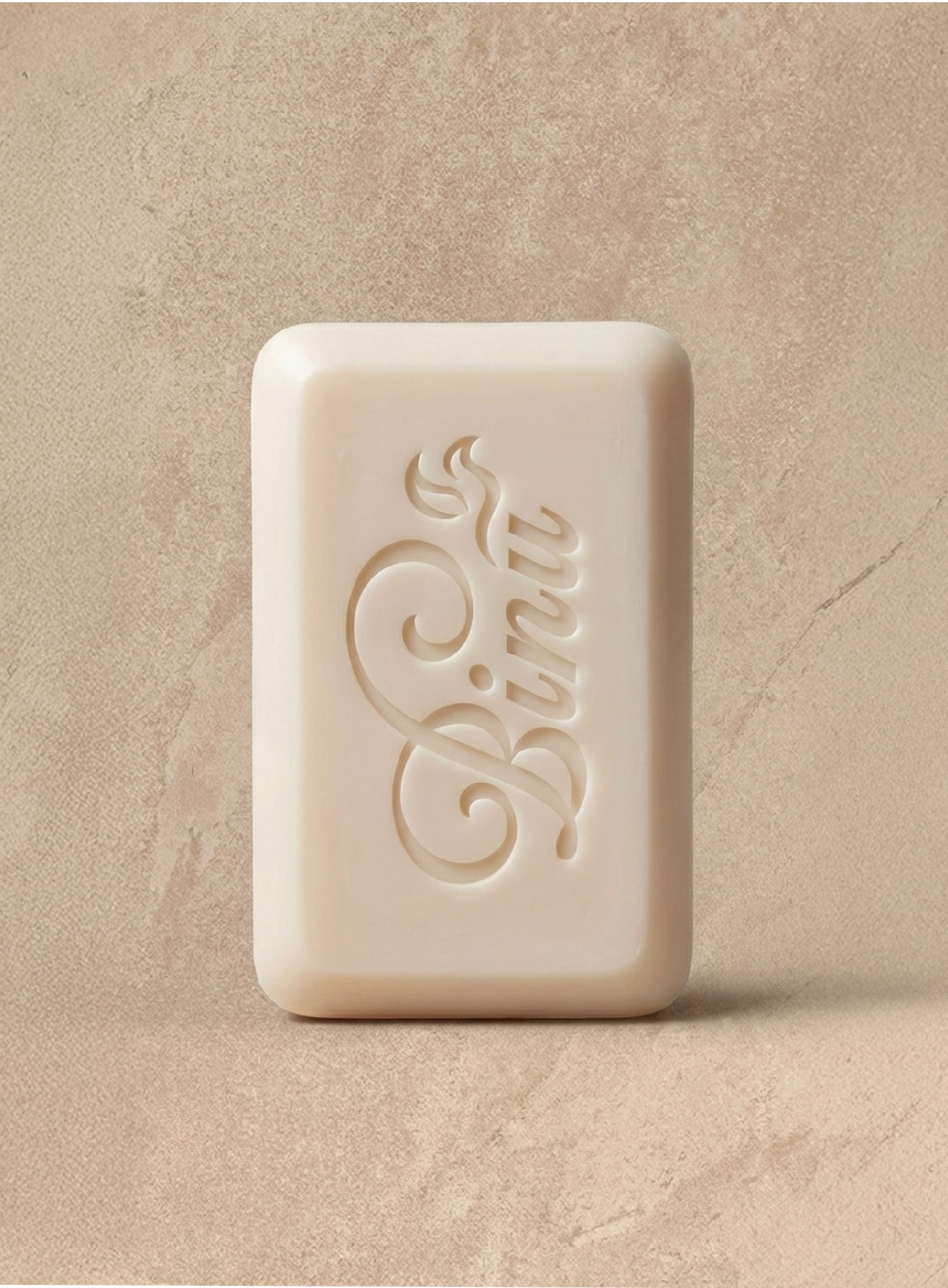
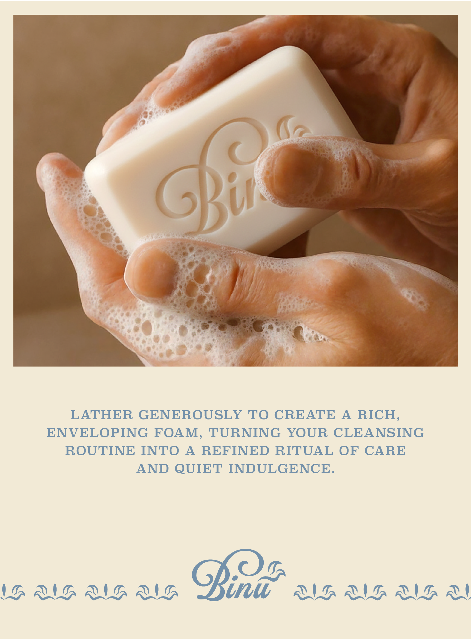
A gently crafted artisanal soap bar, Binu is inspired by classical European sensibilities and designed to cleanse with quiet elegance. Timeless in both function and aesthetic, it reflects a tradition of thoughtful craftsmanship.
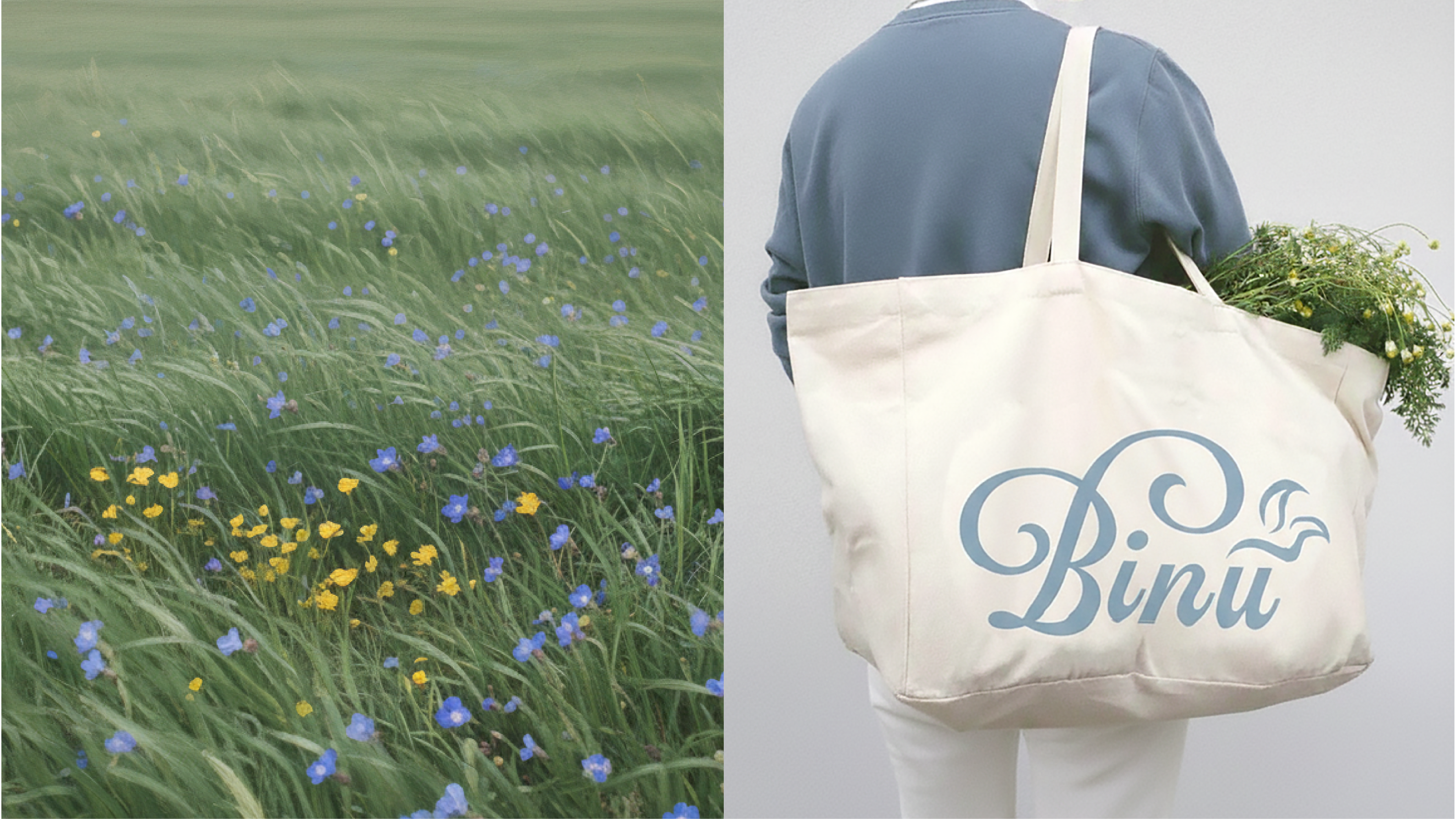
The name Binu comes from Korean, meaning “soap,” and the logo combines a decorative, classic typeface with an abstract leafy and bird motif, conveying purity and softness. The packaging draws from classical European design, reinterpreted in a more gender-neutral way. Colors were carefully chosen to evoke the soap’s soft, creamy texture, inviting consumers to see, touch, and experience the product’s luxurious quality.
These visuals were designed for use across social media, digital platforms, and retail environments, ensuring a consistent brand presence at every touchpoint. The illustrations and packaging renderings were produced with the support of AI tools, blending creativity with cutting-edge technology.


︎︎︎ Back to home