Beauty, Cosmetic - Skin care
Branding, Art Direction, Packaging, Product
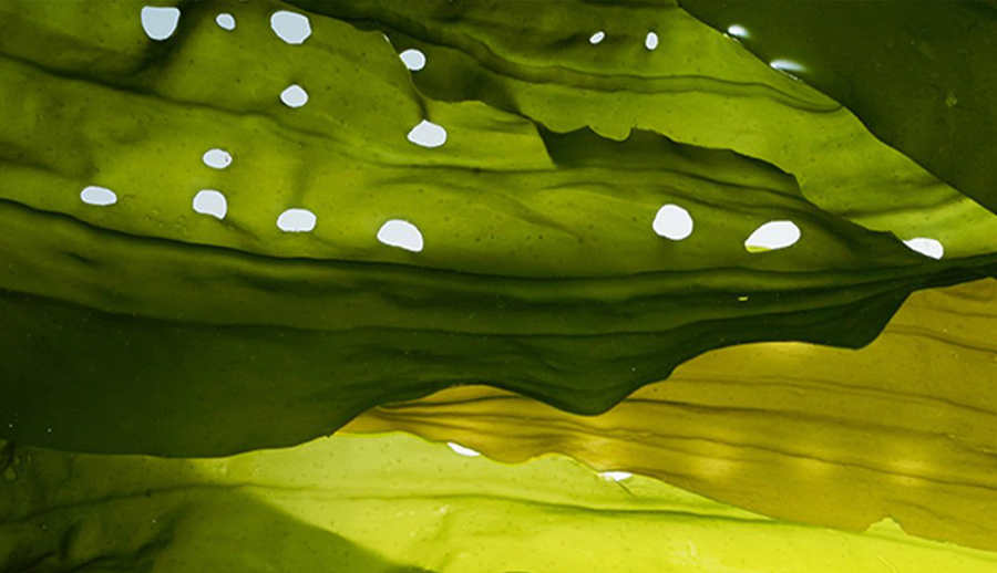
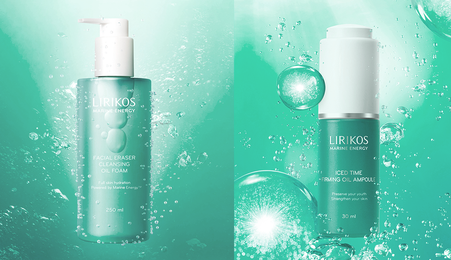
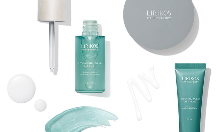
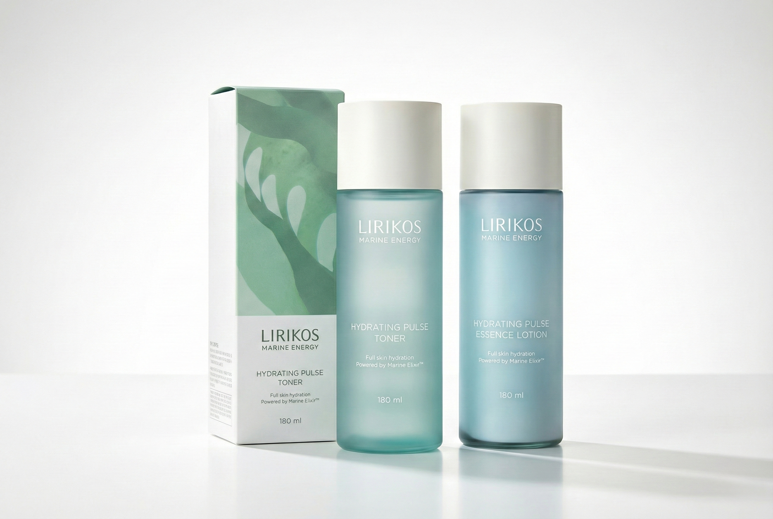
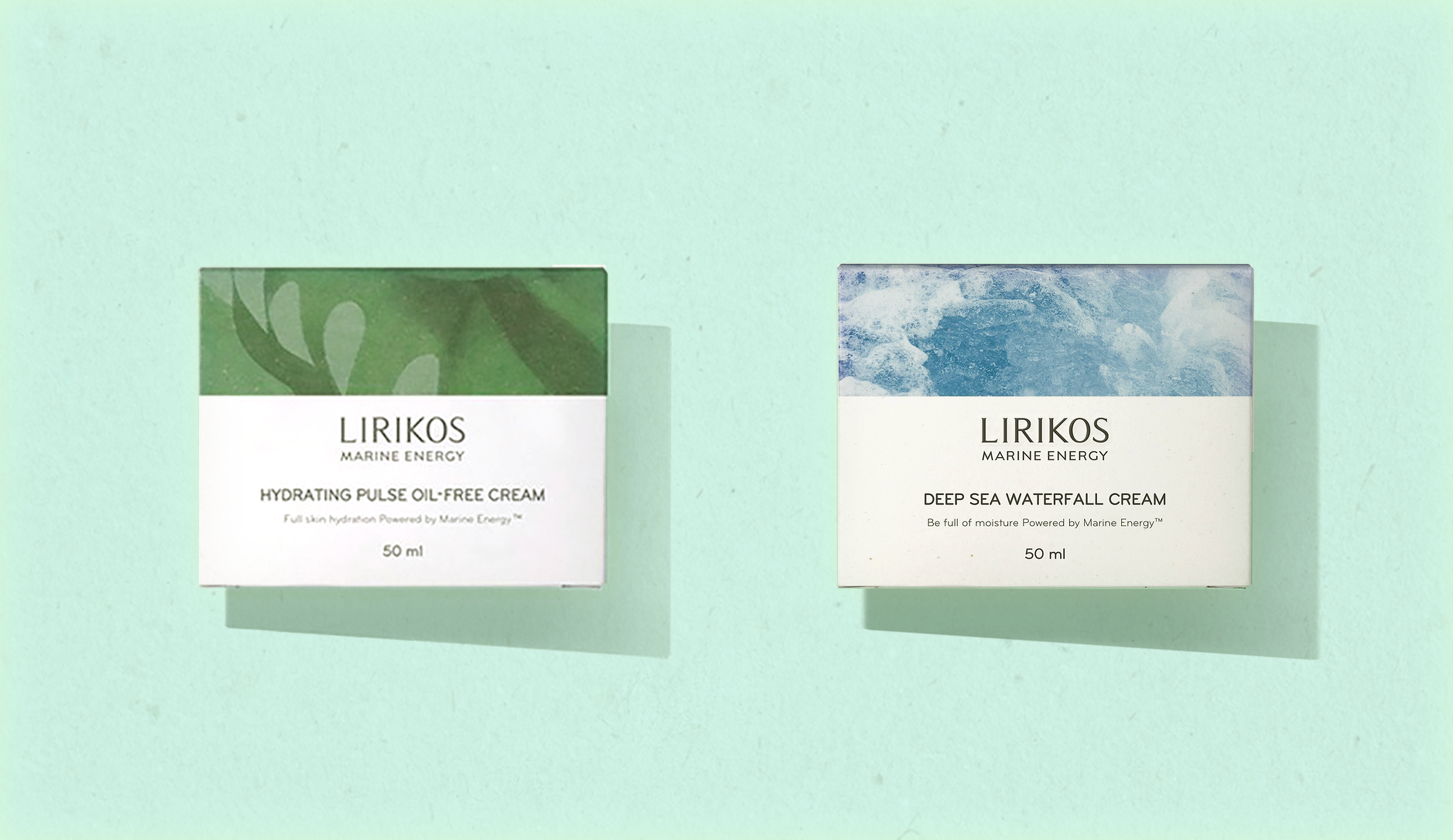
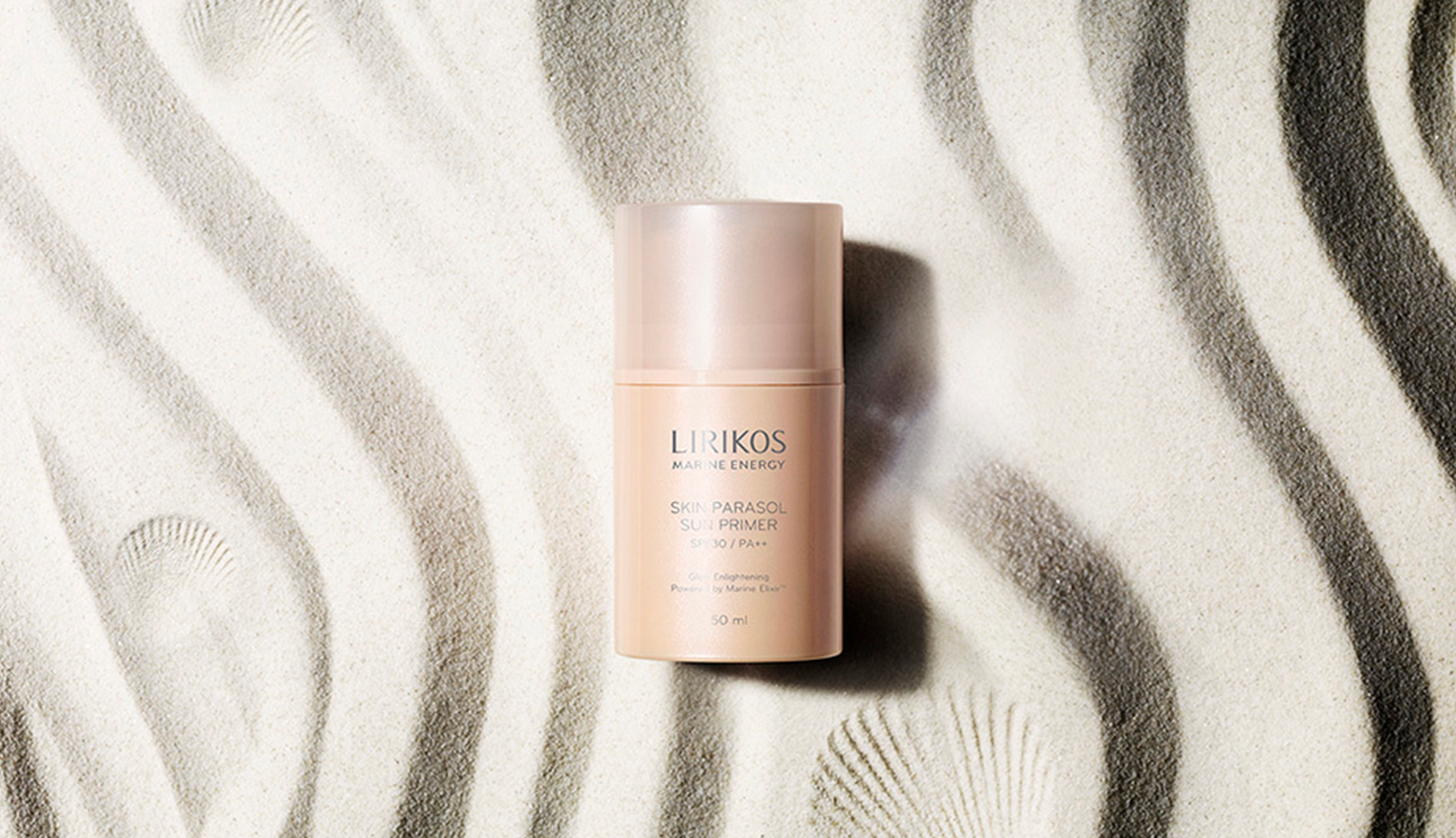
Lirikos launched Lirikos Marine Energy, a new marine-inspired skincare brand targeting a younger audience at a more accessible price point. Like the original Lirikos line, the focus remained on ocean-derived ingredients, emphasizing the power of natural resources. Designed and built the entire brand system and visual identity, including the color palette, packaging design, and art direction for key visuals to communicate freshness, purity, and youthful energy. As requested by the marketing team, I focused on showcasing natural ingredients throughout the product and packaging design. I directed the photographer to capture subtle, elegant shots of the ingredients in an illustrated style, ensuring they translated beautifully onto the cartons and labels.
As requested by the marketing team, I focused on showcasing natural ingredients throughout the product and packaging design. I directed the photographer to capture subtle, elegant shots of the ingredients in an illustrated style, ensuring they translated beautifully onto the cartons and labels.


︎︎︎ Back to home